When authors talk about visual language they refer to the message communicated through the way the type looks, not necessarily the meaning of the actual words. Verbal language on the other hand refers to the idea communicated through the actual meaning of the words. A good example of the use of visual language can be shown in the first image of "hello". Its use of huge font, all lower case letters and only small gaps between letters gives the word an energetic, in your face feel that succeeds the face value of the word itself. According tot he authors, typography can be used to communicate a message to evoke a response in the viewer. An example is the piece "a diplomat is a person who can tell you to go to hell in such a way that you actually look forward to the trip." The piece makes you double take to make sure you read that right and it's use of elegant font on the "go to hell" communicates the suave way the "go to hell" is concealed by diplomats. This example as well as the "hello" image I discussed shows how an artist's choice of type can affect the way a message is interpreted, changing the connotation of the word or phrase. Overall I have learned that the font, size, color and placement of type can all have an affect on the message a word or phrase sends.
|
Electra and Ian were assigned the: filter gallery tool. This tool is essentially a more convenient way to access filters to apply to images. To access filter gallery, look to the top center of your screen for an option named filter. If you click this a drop down window will appear with an option named Filter gallery. If you select this, a menu will appear displaying your image and a window to the right of it with many filter choices, select a filter and click "OK" to apply. If you want to add a second filter click " add new effect layer". We selected a sample image of a waterfall and tried many different affects with the filter options given. We put them on the slide so you can see the difference of how the filters change the way the picture is seen. In the future, we will use this tool in projects that require the use of filters because of the customization of the filters. To anyone using this tool, we suggest that you follow the directions given because when adding a second layer without it looking like it has too much going on at one time you want to know how to apply and layer it. It may get confusing.
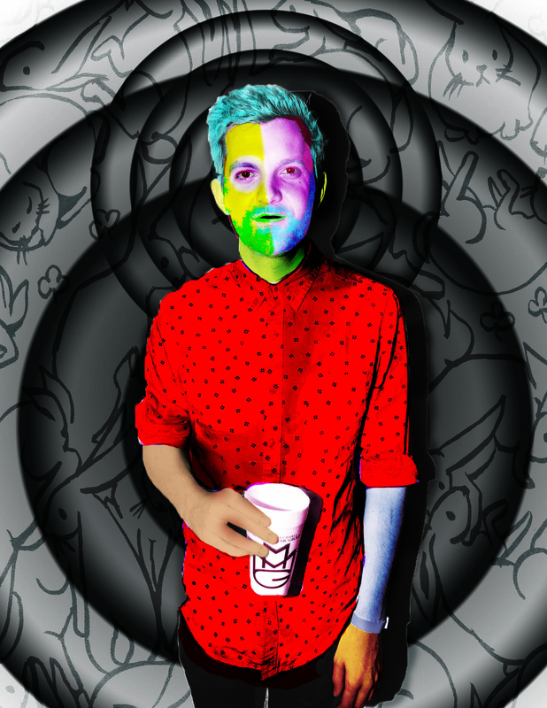 I chose Dillon Francis as the subject for my Photoshop portrait. I specifically chose Francis because he is a musical artist I used to love and listen to everyday. The image was also perfect for this assignment. To alter the original image I used mainly custom brushes in which I edited the spacing, opacity, brightness, and filter of currently existing brushes. One of the main filters I used on my painting was color burn which gave the color a deep, rich hue and I realistic overlay to the image. This made the tool one of my favorite to use because of how vibrant and intricate the final image appeared. So, the image above was originally mainly white. I used color burn and dark color filters to give the paint I used extra vibrance and I used a low opacity, black feathered brush to add shadow shown in the darker regions of the image. The background is a rabbit pattern with edited gradients that I made appear like ripples or dark halos. The image is similar to what a real oil painting would be like because it uses very expressive, deep colors to illustrate the ordinary. It differs, however, because my use of neon colors, the rabbit background, and extremely exact geometry and detail would be difficult to imitate with real paint. If I could restart I would change what I did by using a more diverse pallet of colors on the shirt because it dominates the image with the bold, brash red.
|
AuthorI'm a 15 year old student studying digital art and I've always had a passion for drawing and graphic design, welcome Archives
May 2015
Categories |
 RSS Feed
