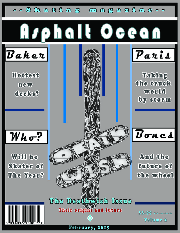
I chose a theme of skating for my magazine cover and so I gave it the title: "Asphalt ocean", to refer to the road. On the cover I advertise skating paraphernalia like trucks and wheels. The stories would be appealing to skaters because they are about topics having to do with professional skating and about goods that are necessary to skate. In the background I used an image of a spinoff logo I drew of the company "Death Wish". I selected this image because it is of a relevant skate company logo. I edited the image by tweaking the contrast and by playing around with the actual pattern on the logo to make it pop more. Specifically I used the contrast tool and liquify tool to make it stand out more and give it that melting appearance. The main font I used in my cover is called cooper std. i chose this font and bauhaus 93 because they both give off a skater vibe and don't look overly formal without looking tacky. I used bauhaus in the mast head and not in the cover lines because it's a more interesting font to look at and it draws the eye in. I edited the text in my cover lines and captions by boxing in my cover lines to give them over the captions which I kept a lighter font. Specifically I used the shape tool to break up the text on my cover to distinguish different sections and articles. If I were to start over on my cover, I would make sure to use a larger more interesting image and to use a color scheme that draws the eye in more.
 RSS Feed
