It's important for magazines to have a consistent design that it can be easily recognized by customers. The basic concept of typographic hierarchy is, more important information should be larger or bolder. A designer would sketch the magazine cover first to ensure it is set up how they want it to look. A magazines Masthead must remain constant through all its publications. This must remain the same so that it can be easily recognized. I also found the point of ensuring type over a photo or background must contrast important and will be sure to use it to give my magazine cover a bold, easy to read surface.
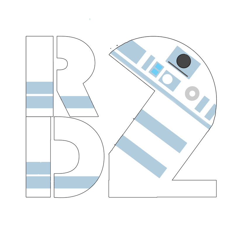 Three elements that are important to logo design are the type tool, shape tool and the ability to rasterize an image. For my image I chose the hero R2D2. I chose him because he is an underdog hero who is often overlooked. I made sure that his color scheme and elements of his actual body design were incorporated into the "2". To create my logo I used the ellipse and rectangle tool to create the "2" in my logo. I edited these shapes by using the marquee and eraser/paint tool to change their appearance. For the color scheme I chose light blue, white and grey/black because this reflects what R2 looks like in the movie. I used type in my logo to write the "R" and the "D". I used the Bauhaus 93 font. The three tools that were most important to me were the marquee tool, erase tool and and paint toll to take my boring logo from bland to exciting. If I were to re-do my logo I would Give the logo a more exciting color scheme and add more details.
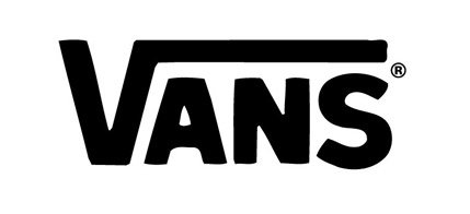
I chose the Vans logo because I like its classic, simplistic design. It is catchy but not flashy and has become a global symbol. I think that the design's simple, two color pallet, makes the logo easy on the eyes and memorable. I think it;s choice of font was also a good choice. It is blocky and aesthetically pleasing. Finally I think that the line that bridges over the words gives a feeling of completeness and compliments the font well. The company and logo were first created in 1966 and represented the company's main product: shoes. The logo itself has remained virtually unchanged but a second was created after the first. Both are still in use but they vary drastically. The original is a blocky word that has an overarching line that spans the entire top of the word. The second features a cartoonish skate board with the original logo in it along with the addition of the words "off the wall" in parenthesis. If I were to redesign the logo I might include some reference to shoes because that is the main and original sale of the company. The logo might feature the word "vans" on the underside of a shoe, etc.
|
AuthorI'm a 15 year old student studying digital art and I've always had a passion for drawing and graphic design, welcome Archives
May 2015
Categories |

 RSS Feed
