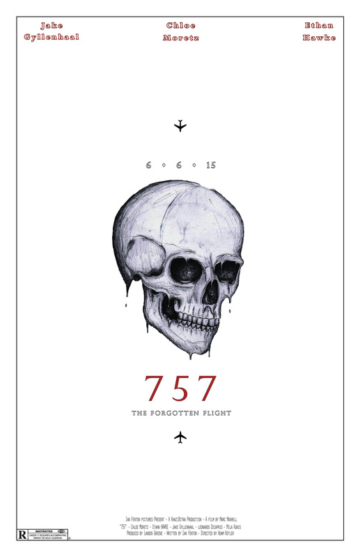
What I did in this project was create a minimalistic, teaser poster for a horror film taking place on a 757 plane, hence the title "757". To keep with my minimalist theme I used a simple red, black, and white color scheme and left the poster fairly barren, bringing the entire focus to the illustrated skull in the middle. I chose this route for my poster because I feel like less is more and it's very easy to make a poster look gaudy and tacky if it contains too much type or a bad image. I felt that the minimalist approach allows for a more elegant and enticing experience. I think the two most successful components of my poster are my color scheme and focus on the skull. The color scheme works well with the genre of my poster and the minimalist theme, while the skull keeps the audience interested. I think the two components that need the most work are my use of text and my title. i think I could have used fonts that matched my theme better and I feel that the title is weak and could be more creative. Initially I planned to make a minimalist poster, however, instead of a skull as the focus, I was going to use a plane as the center image. I changed this because The image of the plane wasnt interesting enough to make up for the barren layout of my poster. If I had to start over I would spend more time choosing my fonts so that the poster had a more unified feel and clear genre.
 RSS Feed
